Table of Contents
- Overview
- Data Modeling
- ETL with Power Query
- Creating Financial Metrics with Excel
- Creating Financial Reports with Excel
- Bonus Automation with VBA
- Conclusion
- Downloadable Content
Overview
If you haven’t done so already, please review part one in this series covering accounting, finance, and business intelligence data modeling basics (Financial Modeling in Business Intelligence, Analytical Ants). A summarized brief: Accounting is a double-entry method for record keeping, and those records are aggregated into financial reports for analysis and insights. Business Intelligence is the practice of modeling functional events with data; therefore, modeling the financial function through business intelligence is a logical and functional exercise to streamline corporate reporting and awareness.
This article is part two in a three-part series. We will build on the concepts in part one to execute financial modeling and reporting in excel. We will be utilizing Power Query for ETL, excel spreadsheets for reporting, and VBA for extra (non-essential) functionality. The intent is to develop better spreadsheets with longevity, maintenance, performance, and optimization in mind.
Please note, we are not going to deploy these concepts to pivot tables; however, the structure will be so that one could retroactively apply part-three learnings (Financial Modeling in Power BI) to this article with a few adjustments. Please reference the following article for tips on how to execute many to many in Excel 2016 (i.e., Power Pivot) (Many-to-Many relationships in Excel 2016, SQLBI).
Without further ado, let’s dive in!
Data Modeling
As referenced in part one of this series, the optimal BI structure is a Star Schema (i.e., a fact table which describes an event surrounded by dimension tables for slicing and dicing). In the case of financial reporting, we need to deploy advanced outrigger tables to automate the structure of financial statements. This way, selecting a financial statement will propagate appropriate filters and relationships without additional logic. Below is the ideal data structure as seen in an ER diagram within Power BI:

In this Excel guide, we will not be utilizing Power Pivot in its intended fashion (i.e., as an analysis services engine for BI reporting). However, we will be structing our data via the best practices described above, and this will give us the logical roadmap needed when procuring our excel cell metrics. We will review this by loading the tables into Power Pivot’s memory to utilize the ER diagram functionality:

Note how the structure is nearly identical to the model found in Power BI. A Star Schema (i.e., fact surrounded by dimensions) with an outrigger table for reporting. Note how in this instance, Excel’s Power Pivot engine does not support the many-to-many relationships nor bidirectional filtering propagation as in the Power BI model; an intermediary bridge table is needed to satisfy this requirement. This is a very common pattern that has been used for decade. Here is a blog post on the subject from BI experts SQLBI: Different Many-to-Many options, SQLBI.
Again, although we will not be utilizing this pivot table model, understanding how the model works is essential because we will be replicating the logic in excel for optimal performance and sustainability. Namely, we will need to ingest keys from a report, traverse the bridge table, and propagate those filters to the Chart of Accounts so we can query and extract needed information from the General Ledger.
Now that we have a goal for the data, we will use Power Query to extract the needed data and format it into the appropriate structures for reporting.
ETL with Power Query
The data we will be using is a randomly generated general ledger modeled after a retail business. The dataset features ‘unclean’ data that will require light ETL work to clean and structure. You can find more information about the randomized generator here: Randomized Retail GL Generator, Analytical Ants. Effectively, we will be loading and cleaning a fact table and building our residual dimension tables from it.
Loading the Fact Table
To open Power Query in Excel, navigate to Data in the ribbon > Get Data > Launch Power Query Editor.
Selecting a query from the ‘Queries’ pane on the left hand side will show the preview (middle) and the applied steps (right). Selecting different applied steps will show the different actions taken to clean the data. In the case of the fact table, we:
- Sourced the data from GitHub (CSV file)
- Promoted headers and changed data types (automatic)
- Filtered the rows where “Description:” was in the Date field. If needed, we could extract this data into its own dimension table, but that’s a bit outside of the scope for now. For now, just know that the “Description:” text messed up the auto-detect type for the Date column.
- Readjust the date column to be dates, readjust the Account to be an integer
- Rename fields for Business ease-of-use (Kimball best practice), and remove denormalized columns.
Feel free to go through each table to see the transformations. The short is that Calendar is auto generated based on values in the General Ledger and the Chart of Account find unique attributes based on the fact table.
Notice how we are building out each table according to BI best practices described in the prior section.
The interesting tables are the ‘Bridge’ and ‘Report’ table. These are manually entered but could be parameterized in the future for ease of use and automation; maybe we can get to that in a future post.
A high-level summary of these tables:
- Report tables: The surrogate key is the ‘Report Key’. This sequential unique number identifies the row of the report and establishes the order (in this instance). More information on surrogate keys can be found here: Surrogate Key, Kimball. Also, notice the ‘Indicator’ columns. These will be used for calculations and reporting. For reporting, they will establish rules for Conditional Formatting to perpetuate report formatting with minimal intervention.
- Bridge tables: These tables establish the many to many relationship between the Chart of Accounts and Report tables. They have the Report Key with associated Account Keys so that logical propagation can ensue.
- Note, these tables establish the bulk of the logic for reporting. Take time and consideration when building these tables! Building these tables appropriately will ensure minimal maintenance for your report and architecture going forward.
With the table transformation complete, we will now load the tables into memory. In the top right, you will see a ‘Close & Load’ button. Click it, and then select ‘Close and Load to’. Once selected, select ‘Table’ in the new window for loading the data. If given the option, load the tables into one excel sheet right next to each other (as shown below). This reduces maintenance and cleans up your solution. The exceptions are the report tables. They will be loaded onto their own spreadsheets respectively. The following image shows the Data tab where non-report tables are loaded:
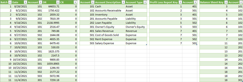
Note: If you want to deploy this model to power query, you will select ‘Only Create Connection’ and ‘Add this data to the Data Model’.
We are now in the position to create our financial metrics!
Creating Financial Metrics with Excel
We will only be creating two metrics for this entire solution. One metric will be for the Income Statement, and the other will be for the Balance Sheet. Yes, only two metrics! No intermediary pivot tables, calculated cells, or VBA required. These metrics will compute the correct amount and will propagate themselves to new data! More on propagation in the ‘Creating Financial Reports with Excel’ section below.
I’m going to start by showing the final formulas and work retroactively to describe how they work. I will show the Income Statement formula first, and then the Balance Sheet formula second.


To start, the functions utilize structured references, LET, and Array functions. Please familiarize yourself with these terms here: Structured References with Excel Tables, Microsoft; LET function, Microsoft; Array formulas, Microsoft. A simple breakdown of these terms:
- Structure references allows us delegate referencing so we are no longer lost in endless cell references. For example, [@[ColumnName]] will allow us to always reference the row of a column where the metric is deployed. For instance, if the metric is on row 8, it will reference the value in [Column] row 8. Additionally, referencing a Table[Column] will allow us to reference an array within our metrics so we no longer must adjust the cell range as the data grows.
- LET functions allow for variables in your code; these are robust calculation outputs that can be inclusive of arrays.
- Array formulas allow users to work with vector rather than scalar data. For example, a full column of data can be ingested and processed rather than referencing a single value.
The formulas are broken down into six steps:
- Step 1 – Report Key: Identify the report key. This is the input that drives the entire output.
- Step 2 – Indicator: Identify the Indicator. Find the respective indicator per the accounts table.
- Step 3 – Accounts Array: List all subsequent accounts associated with the report key.
- Step 4 – Account Type: List the Account Type associated with the Accounts Array.
- Step 5 – Compute Amounts: Compute Amounts for each value in the Accounts Array based on the Account Type.
- Step 6 – Consolidate with LET: Consolidate all prior steps into one metric.
The downloadable file, “Financial Modeling in Excel – Start’ has a guide to show case each step. We will use the following as an example:
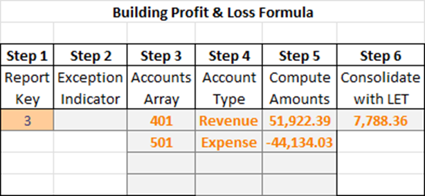
- Step 1 – Report Key: The report key example is 3 (i.e., Gross Margin)
- Step 2 – Indicator: The Gross Margin field is not an ‘Exception’ based on the report table.
- Step 3 – Accounts Array: Gross Margin is composed of accounts 401 and 501 based on the bridge table.
- Step 4 – Account Type: Account 401 is a Revenue account; 501 is an Expense based on the Chart of Accounts table.
- Step 5 – Compute Amounts: The amount for 401 is $51K, amount for 501 is -$44k based on the General Ledger table.
- Step 6 – Consolidate with LET: All prior steps are consolidated into this one metric.
Note: A discerning eye will notice how the Profit and Loss metric has a start and end date, but the Balance Sheet metric only has an end date. This is because a Profit and Loss statement is a snapshot within a period. A balance sheet is cumulative of all prior transactions until a certain point.
A full walk through can be found with this YouTube video: Financial Modeling in Excel, Analytical Ants (below):
On the final version, we will not need any intermediary steps – this was for educational purposes only. We will only need the data tables, the report tables, and then the metrics. Download the final version at the end of this article to see the final output.
Creating Financial Reports with Excel
Let’s recap, the current solution has three tabs: One for all data (General Ledger, Chart of Accounts, and both bridge tables) and then one for each report table (Profit and Loss and Balance Sheet). Also, we have two metrics that procure different financial statements respectively. Let’s start building our finalized solution.
First, we will go to a report page and add ‘Date Parameters’ so the metric adjusts based on the user selection. Once they are added, copy and paste the respective metric into the cell adjacent to the last column, first row of data. This will create a new column (Column1) that auto populates the cell with the metric. The cells will auto fill, so even when report template changes, the metric will still compute appropriately because we established the model correctly. See how everything ties now 😉. Simply make sure the metric is pointing to the new ‘Date Parameters’ on your sheet.
Now, it’s a matter of formatting to get the report looking correct. These are the steps I took which enable the report to maintain it’s look without need to continuing maintenance:
- General Report Formatting. I added a title, the report title, and a dynamic cell to show case the current selected date range. Additionally, I padded the report with one column (width = 1) of white with an exterior border. This will allow the report to grow and maintain a consistent look and feel without any additional maintenance.
- Report Conditional Formatting: I selected the table, added a new rule based on a formula, and then applied the required logic and formatting.
- Example, Formula $H7 = “Y” will format all rows of a table where the ‘Header Indicator’ is yes. This allows formatting automatically, again – nothing manual.
- Note, the ‘Applies to’ range may need to be updated as the table grows. One can automate this through VBA.
- Report Formatting: I selected the table, went to Table Design, and selected ‘none’ in the Table Styles. Then, in Table Style Options, I removed Header Row and Banded Rows. Last, I selected the full table and made the background white. Formatting the table this way allows formatting to occur through conditional formatting (above) and utilize the table features (i.e., ingesting data automatically).
The final product will look something like the following:
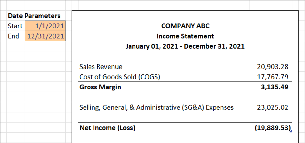
Effectively your solution is done! The report is now fully operational with minimal moving parts! The metrics will appropriately curate their appropriate financial statements based on the data model established, and conditional formatting will keep the report looking nice! The only manual maintenance is managing the data model in case you want to change the template. Additionally, the only manual tasks to operate the report is simply refreshing the data model by going to Data (ribbon) > Refresh All (Queries & Connections). That’s it!
We won’t leave you there though, in the next section, we will add a Refresh and Print button to make the user experience as easy as possible.
Bonus Automation with VBA
We will add to buttons to ensure the report is as user friendly as possible. A Refresh Data button will allow users to refresh the entire model to ensure they have the latest data. A Print Data button will print the desired area (indifferent if the report grows!) and add nice footers with page numbers and dates!
Refresh Data
We will add a VBA Macro to refresh the data. If your data is loaded to your Power Pivot Model, you can simply use the ActiveWorkbook.Model.Refresh command. If not, you will need to refresh each table individually. Below is the code that will wrap the refresh in a timer and output a message when the execution is complete:
Sub Refresh_Data()
    Dim StartTime As Double
    Dim SecondsElapsed As Double

    'Remember time when macro starts
      StartTime = Timer

    '*****************************
        ActiveWorkbook.Model.Refresh
    '*****************************

    'Determine how many seconds code took to run
      SecondsElapsed = Round(Timer - StartTime, 2)

    'Notify user in seconds
      MsgBox "Data Refreshed! Time lapse: " & SecondsElapsed & " seconds", vbInformation

End Sub
Print Report
Printing the report will select the target range, add a footer, and open the print preview screen. The dynamic range works by finding the last cell in a specified column. This will allow the report to grow and always reference the appropriate cell for printing. Again, fully automated. Below is the code:
Sub Print_ProfitLoss()
'' Report Area
Dim x As Integer
        x = Cells(Rows.Count, 10).End(xlUp).Row
    Set ReportCorner = Range(Cells(3, 7), Cells(x, 10))

''Set Print Areas
    Sheets("Report - Profit and Loss").Select
     With ActiveSheet.PageSetup
        .PrintArea = ReportCorner.Address
        .CenterHorizontally = True
        .LeftFooter = "____________________________________________________________________________________________" & Chr(10) & "&D  &T"
        .RightFooter = "Page &P of &N"
    End With

''PrintPreview
    Sheets(Array("Report - Profit and Loss")).Select
    ActiveWindow.SelectedSheets.PrintPreview
    'Sheets("Closed House Analysis - Report").Select 'Needed so that multiple sheets don't remain selected


End Sub
Simply add buttons to your workbook, assign the appropriate macros, and you have automated this full report!
Conclusion
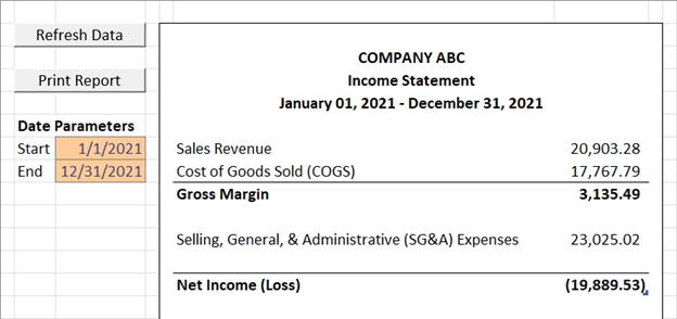
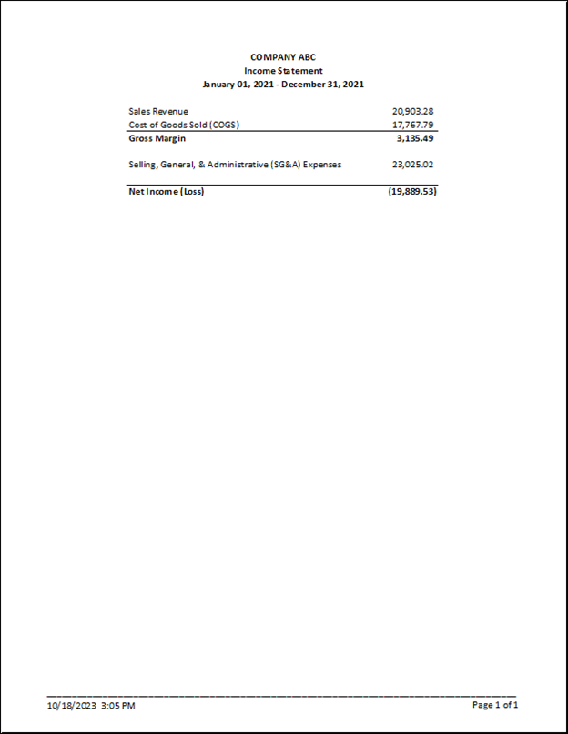
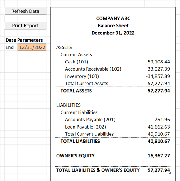
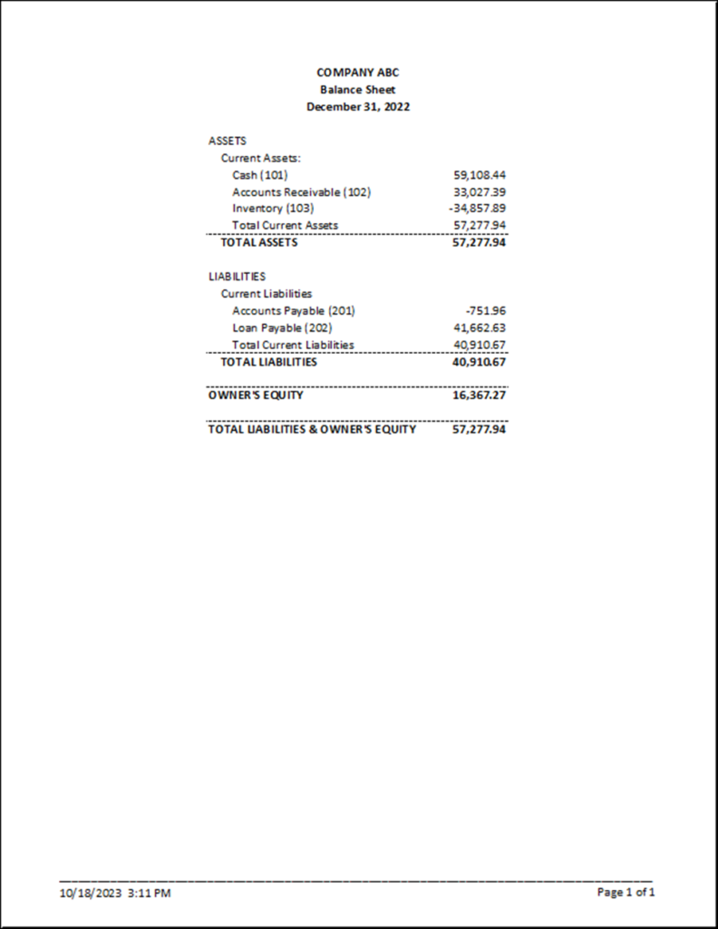
Accounting and Finance have a long history with a proven track record. Automating the reporting process should be simple and fun with the right Business Intelligence architecture. The best part is that the modularity of this design allows continued automation of information delivery. Need to procure more expressive financial reports and metrics, you absolutely can automate that with this process! Need to incorporate more functional areas? It’s easy as this structure allows for portability as it utilizes data warehousing best practices! Below are the final report views and prints for the financial statements. Feel free to download the sample reports below and reach out to Analytical Ants for any Data Engineering, Data Analysis, or Data Science inquiries!
Profit and Loss worksheet and print
Balance Sheet worksheet and print
Downloadable Content
Downloadable report available via our store!
Free download coupon code: Financial-Reporting-in-Excel-202310
This article was created & published by William Rodriguez, President and Principal Consultant at Analytical Ants
Reach out to Analytical Ants LLC for all your data/analytical needs. We specialize in #DataEngineering #DataScience, and #DataAnalysis. More Information can be found here.

Pingback: Financial Modeling in Power BI (Part 3) - Analytical Ants